SlideBox
A pager that presents one of an ordered set of slides, with animated navigation,
interactive swiping and optional neighbor peeking. Each slide is a lazily-realized
DataTemplate whose content is retained forever once created — slide state survives
navigation, making SlideBox ideal for wizards, onboarding flows and tab-like content areas.
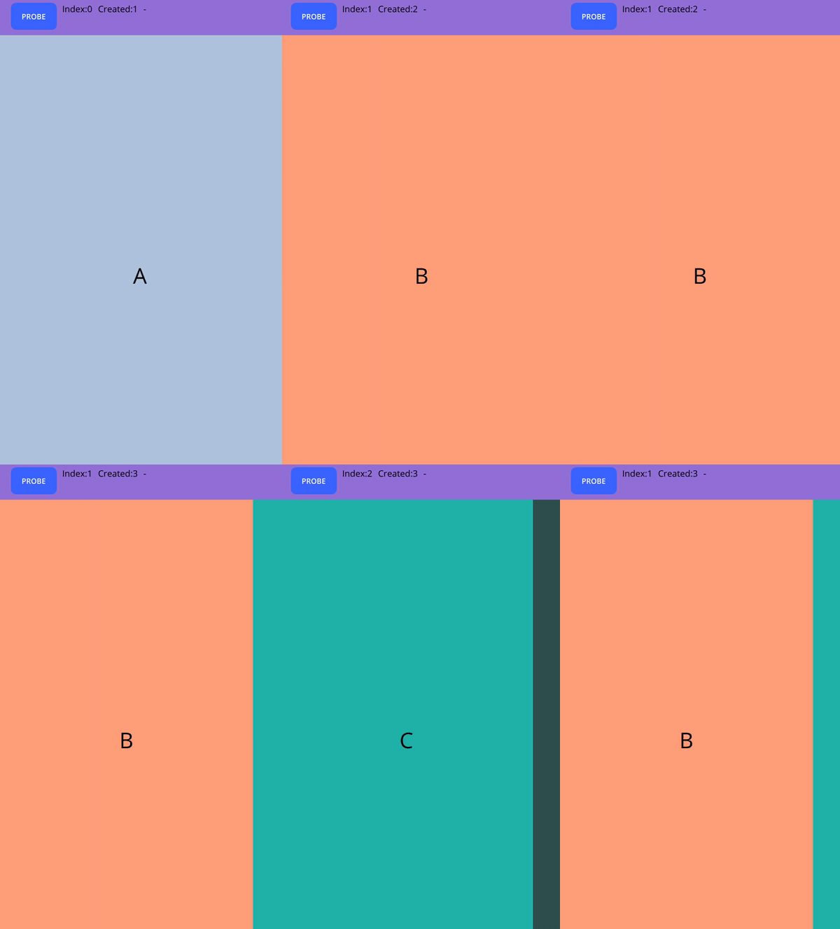
<nalu:SlideBox SelectedIndex="{Binding Step, Mode=TwoWay}">

    <nalu:SlideBoxItem>
        <DataTemplate>
            <views:WelcomeStep />
        </DataTemplate>
    </nalu:SlideBoxItem>

    <!-- Disabled slides drop out of the sequence: swipe and Next/Previous skip them -->
    <nalu:SlideBoxItem IsEnabled="{Binding HasProFeatures}">
        <DataTemplate>
            <views:ProConfigStep />
        </DataTemplate>
    </nalu:SlideBoxItem>

    <nalu:SlideBoxItem>
        <DataTemplate>
            <views:SummaryStep />
        </DataTemplate>
    </nalu:SlideBoxItem>
</nalu:SlideBox>
Lazy realization and retention
- A slide's template is instantiated the first time it is presented (or when it becomes the visible neighbor of a peek/swipe). The heavy step the user never opens is never built.
- Once created, content is retained forever: navigating away and back preserves entry text, scroll positions and any other view state.
- Setting
IsEnabled="False"excludes the slide from the sequence and tears its content down (the realized view is removed and its handlers disconnected). Re-enabling rebuilds it lazily on the next visit — a clean way to reclaim memory for conditional steps. - Slide content inherits the
SlideBox'sBindingContextas usual;SlideBoxItem.IsEnabledis bindable too (items are logical children).
Scoping the content with ContentBindingContext
Like ViewBox, each SlideBoxItem offers a ContentBindingContext property
to scope the realized view to a given object — handy to hand each slide its own sub-model
instead of the page-wide context:
<nalu:SlideBoxItem ContentBindingContext="{Binding ProStepModel}">
    <DataTemplate>
        <views:ProConfigStep x:DataType="models:ProStepModel" />
    </DataTemplate>
</nalu:SlideBoxItem>
When set, the value is forced on the content as soon as the template is realized (before it can observe the inherited context), kept in sync on later changes, and cleared when the content is torn down.
Navigation
| Member | Description |
|---|---|
SelectedIndex |
Two-way bindable index into the FULL item list. Values pointing at a disabled item are coerced to the nearest enabled one (-1 when no enabled item exists). |
SelectedItem |
The currently selected SlideBoxItem (read-only). |
Next() / Previous() |
Move to the nearest enabled slide; return false at the ends (no looping). |
SelectedIndexChanged |
Raised with old/new index and item. |
If the selected slide becomes disabled, the box automatically advances to the nearest enabled neighbor.
Swiping
IsSwipeEnabled (default true) lets the user drag between adjacent enabled slides:
one page per gesture, a ⅓-page commit threshold, and rubber-banding when dragging past the
first or last slide. The gesture is implemented with a cross-platform pan recognizer — no
platform-specific code — and transitions retarget seamlessly from wherever the finger
released.
Programmatic transitions are direction-aware translations tuned by TransitionDuration
(default 250ms) and TransitionEasing (default CubicOut).
Peeking
PeekAreaInsets keeps the adjacent slides partially visible at rest, CarouselView-style:
<!-- The NEXT slide peeks 40dp from the end edge -->
<nalu:SlideBox PeekAreaInsets="0,0,40,0">
Only the sliding-axis components apply (Left/Right for Horizontal, Top/Bottom for
Vertical); the cross-axis values are ignored. A peeking neighbor is realized eagerly —
it is visible, after all — while non-peeking slides stay lazy.
Orientation and safe area
Orientation (Horizontal default, or Vertical) picks the sliding axis. The safe-area
contract follows it (on .NET 10):
- insets on the sliding axis are consumed by the box (
Container), so the page slot and peek bands never hide under a notch; - insets on the cross axis flow through untouched — handling them belongs to the slide
templates themselves (e.g. a full-bleed background extending under the system bars with
its content padded via
SafeAreaEdgesinside the template).
The defaults are re-applied when Orientation changes; assign your own SafeAreaEdges
afterwards to override them.
All properties
| Property | Default | Description |
|---|---|---|
Items |
— | The SlideBoxItem collection (content property). |
SelectedIndex |
0 |
Two-way bindable selection, coerced onto enabled items. |
SelectedItem |
— | Read-only selected item. |
IsSwipeEnabled |
true |
Interactive dragging between adjacent slides. |
Orientation |
Horizontal |
The sliding axis. |
PeekAreaInsets |
0 |
How much of the adjacent slides stays visible at rest (sliding-axis components only). |
TransitionDuration |
250 |
Slide transition duration in milliseconds. |
TransitionEasing |
CubicOut |
Slide transition easing. |
SlideBoxItem: Template (content property), IsEnabled (bindable),
ContentBindingContext (bindable, scopes the realized view), Content (read-only
realized view, null until first visit or while disabled).