Scaffold Transitions, Shared Elements & Modals
Every page transition in the Scaffold is Nalu-driven: declarative specs, seekable animations, interactive gestures on both platforms — no Shell/Fragment animation quirks.
Page transitions
A ScaffoldPageTransition declares how the pushed page enters (Enter motion: fractional
translation, scale, opacity), what the covered page does behind it (Behind), and the
duration. The pop plays the same spec in reverse. The interactive gestures (iOS edge
swipe, Android predictive back) deliberately do NOT replay custom specs: a horizontal drag
scrubs the standard slide so the page tracks the finger — the page's own spec plays on
programmatic pushes and pops.
Built-in specs: Default (the stock slide from the right, the page behind counter-sliding 35%
out to the left), SlideUpFade, ZoomFade, SlideFromBottom (the modal default), None.
<!-- Scaffold-wide -->
<nalu:Scaffold nalu:Scaffold.PageTransition="{x:Static nalu:ScaffoldPageTransition.Default}">

<!-- Or per page (the spec belongs to the PUSHED page) -->
<ContentPage nalu:Scaffold.PageTransition="{x:Static nalu:ScaffoldPageTransition.SlideUpFade}">
Custom specs are plain records:
public static readonly ScaffoldPageTransition Reveal = new(
    Enter: new ScaffoldTransitionMotion(FractionY: 0.05, Opacity: 0),
    Behind: new ScaffoldTransitionMotion(Scale: 0.97, Opacity: 0.9),
    DurationSeconds: 0.3);
Shared elements
Tag any view on both pages with the same Scaffold.TransitionName — matching pairs fly
between their geometries during push and pop, riding the standard slide:
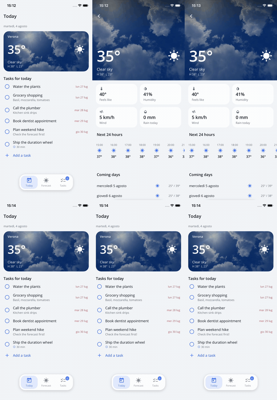
The card's photo, temperature, icon — and even the darkening scrim — fly between the two layouts on push and pop.
<!-- List page: the card photo -->
<Image nalu:Scaffold.TransitionName="weather-photo" Source="..." Aspect="AspectFill" />

<!-- Detail page: the full-bleed hero -->
<Image nalu:Scaffold.TransitionName="weather-photo" Source="..." Aspect="AspectFill" />
The engines (custom on both platforms) are built for truthful flights:
- Flights travel between the visible geometries — clipped/parallaxed content flies as the user sees it, not as its unclipped frame says.
- Image pairs morph their aspect crop; corner rounding follows (a rounded card un-rounds
as it expands, including MAUI
Borderclipping). - Any other pair (labels at different font sizes, scrims, boxes) cross-fades between rendered copies along the path, stacked in the same order as the live layouts.
- Pair your header scrims too (same
TransitionNameon both) so photo dimming stays constant mid-flight. - Unmatched pairs and not-yet-laid-out targets gracefully fall back to the plain slide.
Important
Size a shared element to its content. A flight travels between the two views' bounds,
and the rendered copy is stretched to fill them. A Label left at its container's default
HorizontalOptions="Fill" is mostly empty space: paired across two pages it is the same width
on both, so a font-size change makes the pair differ only in HEIGHT — and the glyphs stretch
vertically instead of scaling. Give both sides HorizontalOptions="Start" (or Center/End,
or an explicit size) so the bounds actually describe the text:
<!-- Both pages: bounds that track the glyphs, so the morph scales instead of stretching -->
<Label nalu:Scaffold.TransitionName="heroTitle" Text="Bot hero"
       FontSize="14" HorizontalOptions="Start" />
The same applies to any pair whose two sides differ on only one axis — a box that changes height but not width will squash rather than grow.
Depth cues
Stacked motions (push, pop, and both interactive gestures) carry one automatic depth cue, identical on iOS and Android: the page revealed beneath sits under a well-visible dim proportional to how covered it still is, lifting as the top page departs. Side-by-side motions (root switches) get no cue — those pages are adjacent, not stacked.
Interactive gestures
- iOS edge-swipe pop: leading-edge pan (RTL-aware) scrubs the standard slide — including
shared-element flights — under the finger; release either completes (dispatching the pop
through the engine) or cancels. On pages whose model implements
ILeavingGuardthe swipe simply does not engage — use the back button, which runs the guard. - Android predictive back: the system back gesture peeks the page below — padded for
where it will land (its own nav/tab bar footprints, not the scrubbed page's) — and scrubs
the pop under the finger, including shared-element flights: matching
Scaffold.TransitionNamepairs fly between the two pages driven by the gesture, complete with the settle on commit, and reverse home on cancel. Committing hands off to the engine pop (guards honored,enableOnBackInvokedCallbackrequired, root pages defer to the native back-to-home preview).
Android back interop
Predictive back requires android:enableOnBackInvokedCallback="true" in the manifest — and
that opt-in is application-wide: every window of the app (dialogs and third-party popup
windows included) switches to the new back dispatch and stops receiving the legacy
KEYCODE_BACK. The Scaffold plays well with the rest of the ecosystem on top of that:
The Scaffold's callback keeps itself topmost on the activity's
OnBackPressedDispatcher. Libraries register permanently-enabled callbacks of their own (analytics SDKs, popup frameworks); if one sits above the Scaffold's it swallows the predictive stream in its emptyStarted/Progresseddefaults — pages still pop, but the scrub silently never runs.AndroidLifecycle.OnBackPresseddelegates keep working. MAUI's activity gives those delegates the first chance at every back press, but its own callback is permanently disabled for non-Shell window content — so the Scaffold pumps the event itself: delegates run first (a consumer wins over every Scaffold concern), and when nothing at all consumes, the press is re-dispatched below, exactly like MAUI's own handling.SDKs that capture back with a permanently-enabled callback (typically analytics/ guide SDKs): a callback that is always enabled and only overrides
HandleOnBackPressedbreaks the predictive scrub for the whole app when it happens to sit topmost — so the Scaffold deliberately stays above it, and such an SDK then only receives the presses nothing else consumes. To keep feeding it every back press, bridge it from the app with an observing delegate — the Scaffold invokes these first, on every press, including the ones that pop pages:builder.ConfigureLifecycleEvents(events => events.AddAndroid(android => android.OnBackPressed(activity => { // Forward to your SDK's tracking API here. return false; // observe, never consume })));Third-party popups hosted in their own window (some vendors present popups as separate focusable windows): while such a popup is focused, the system delivers back to that window — if the vendor never registered an
OnBackInvokedCallbackthere, back does nothing. No library on the activity window (Nalu included) can intercept this; until the vendor adds predictive-back support, restore the old close-on-back behavior from the app:#if ANDROID // Wire these to your popup's Opened/Closed events. Android.Window.IOnBackInvokedCallback? _popupBackCallback; void OnPopupOpened(object? sender, EventArgs e) { if (!OperatingSystem.IsAndroidVersionAtLeast(33) || (sender as IElement)?.Handler?.PlatformView is not Android.Views.View view || view.FindOnBackInvokedDispatcher() is not { } dispatcher) { return; } _popupBackCallback = new PopupBackCallback(() => { // Close through your vendor's API — or stay vendor-agnostic and synthesize the // legacy key the popup's window still understands (verified against DevExpress // dropdown windows on Android 16): var now = Android.OS.SystemClock.UptimeMillis(); view.DispatchKeyEvent(new(now, now, Android.Views.KeyEventActions.Down, Android.Views.Keycode.Back, 0)); view.DispatchKeyEvent(new(now, now, Android.Views.KeyEventActions.Up, Android.Views.Keycode.Back, 0)); }); dispatcher.RegisterOnBackInvokedCallback(0 /* PRIORITY_DEFAULT */, _popupBackCallback); } void OnPopupClosed(object? sender, EventArgs e) { if (OperatingSystem.IsAndroidVersionAtLeast(33) && _popupBackCallback is { } callback && (sender as IElement)?.Handler?.PlatformView is Android.Views.View view) { view.FindOnBackInvokedDispatcher()?.UnregisterOnBackInvokedCallback(callback); _popupBackCallback = null; } } sealed class PopupBackCallback(Action onBack) : Java.Lang.Object, Android.Window.IOnBackInvokedCallback { public void OnBackInvoked() => onBack(); } #endif
Modal pages
Modals are navigation, not overlays — same stack, same lifecycle, different presentation:
<ContentPage nalu:Scaffold.PageMode="Modal"> <!-- Default | Modal | DismissableModal -->
Modalpresents withSlideFromBottom(override with a page transition), hides the back chevron and drawer buttons, and blocks system back entirely (Android back/predictive back, iOS edge swipe) — dismissal is programmatic only.DismissableModaladditionally shows the close (X) button and lets the Android system back dismiss; both route through the navigation engine (guards and lifecycle run). Interactive previews stay disabled for both modal modes — on iOS the X is the only gesture-free affordance.- Push and pop modals with regular navigations (
Push<MyModalPageModel>()/Pop()); the nav bar context exposesIsModal/IsCloseButtonVisiblefor custom bars.
Notes
- Tab/root switches don't use the page spec: neighbouring roots slide in the direction of travel, roots in different areas cross-fade.
- Navigating while the soft keyboard is open dismisses it before the swap on both platforms.
- Transitions with and without shared elements move identically — the flights ride the same page motion.