Scaffold Scroll-Driven Effects
The Scaffold has a built-in scroll channel: one page-attached property connects a
scrollable to the scaffold, and from that moment any numeric, Color, or Brush
property — on chrome or page content — can be driven from the live scroll offset with
plain markup. Materializing nav bars, fading titles, and parallax headers all ride the same
three concepts: a tracker, a ramp, and the ScrollValue extensions — plus the
direction-driven ScrollDirectionValue for chrome that hides as you read on and returns
the moment you scroll back.
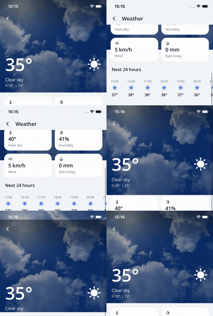
The Daily Helper detail page: transparent bar over the parallaxing photo; scrolling materializes the themed bar, fades the title in — and the status-bar icons flip to match.
1. The tracker
<ContentPage nalu:Scaffold.ScrollTracker="{x:Reference DetailScroll}">
    <ScrollView x:Name="DetailScroll">...</ScrollView>
</ContentPage>
Scaffold.ScrollTracker points at the page's scrollable — a ScrollView, CollectionView,
VirtualScroll, or any view whose platform tree contains a native scroll container. The
scaffold observes it natively (KVO on iOS, scroll listeners on Android) and publishes the
vertical offset into the ambient ScaffoldNavBarContext:
| Context property | Meaning |
|---|---|
ScrollOffset |
The live offset in device-independent units. |
IsScrolledUnder |
Whether content has scrolled under the nav bar (threshold-style checks). |
Each page starts its own scroll story: navigating away and back rebinds the channel, and a
page without a tracker reads offset 0 — bindings settle at their From endpoints.
Two practical caveats: the platform scroll container is searched at most 3 levels below the
tracked view, and on Android a recycler-backed tracker (CollectionView, VirtualScroll)
has no absolute offset — the value accumulates scroll deltas, so with variable item heights
thresholds stay reliable but exact pixel mapping (tight parallax) may drift.
2. The ramp
Effects interpolate inside a window of scroll offsets. Declare the page-wide default once:
<ContentPage nalu:Scaffold.ScrollRampStart="100"
             nalu:Scaffold.ScrollRampEnd="200"
             nalu:Scaffold.NavBarBackground="{nalu:ThemeScrollValue FromLight=Transparent,
                                                                   ToLight={StaticResource BackgroundLight},
                                                                   ToDark={StaticResource BackgroundDark}}"
             nalu:Scaffold.NavBarForeground="{nalu:ThemeScrollValue FromLight=White,
                                                                    ToLight={StaticResource TextPrimaryLight},
                                                                    ToDark={StaticResource TextPrimaryDark}}">
Every ScrollValue on the page rides this ramp unless it overrides it with its own
RampStart=/RampEnd= — which is exactly what parallax does (see below).
3. ScrollValue and ThemeScrollValue
Opacity="{nalu:ScrollValue From=0, To=1}"
TextColor="{nalu:ScrollValue From=White, To=Black, Easing={x:Static Easing.CubicOut}}"
Background="{nalu:ThemeScrollValue FromLight=Transparent,
                                   ToLight={StaticResource BackgroundLight},
                                   ToDark={StaticResource BackgroundDark}}"
| Parameter | Purpose |
|---|---|
From / To |
Endpoint values (numeric, bool, Color, or a Brush — solid or gradient); bool targets flip at t ≥ 0.5. |
FromLight/ToLight/FromDark/ToDark |
Theme-aware endpoints (ThemeScrollValue); dark values fall back to the light ones, and a theme change re-evaluates immediately. |
RampStart / RampEnd |
Per-value ramp override (defaults to the page-level ramp). |
Extrapolate |
Clamp (default: hold endpoints outside the window) or Extend (keep going linearly). |
Easing |
Shapes the ramp interior. |
They work on any element inside the scaffold's tree — a page carrying the attached
nav bar appearance properties included — and must target a bindable
property directly (styles/setters are not supported). In code-behind, bind the values with the
NavBarBindings utility, passing the element the binding is applied to — that is what the page
is resolved from, so the binding reads that element's own page:
offsetLabel.SetBinding(Label.TextProperty,
    NavBarBindings.Create(offsetLabel, "ScrollOffset", stringFormat: "{0:F0}"));
Single-segment paths compile to a typed binding (no reflection, trimming/AOT-safe); deeper paths are evaluated by reflection.
Gradient endpoints
Brush endpoints may be gradients (LinearGradientBrush/RadialGradientBrush), not just
solids — in ScrollValue and ScrollDirectionValue alike:
- Solid ↔ gradient works: the solid side expands over the gradient's stops.
- Gradient ↔ gradient works with different stop counts and positions: both sides are
sampled at the union of their stop offsets and lerped stop by stop; geometry
(
StartPoint/EndPoint, orCenter/Radius) lerps too. Both sides must be the same gradient type — linear ↔ radial cannot interpolate. - Each evaluation emits a fresh brush instance (the plain MAUI binding behavior — safe on any Brush-typed target). The endpoint pair is still normalized only once per binding, so a scroll frame runs just the lerp.
- Gradients rebuild the native shader on every change: fine for direction-value transitions
(a few hundred ms), measurable on a per-frame
ScrollValuescrub — prefer short ramps there.
4. ScrollDirectionValue and ThemeScrollDirectionValue
Where ScrollValue maps the absolute offset, ScrollDirectionValue watches the scroll
direction: scrolling down by ActivateThreshold dp latches an activated state,
scrolling back up by DeactivateThreshold dp latches back to deactivated (the initial
state) — wherever in the content that movement happens. Each flip animates the target between
the two endpoint values over a real duration, so the effect reads as a mode change, not a
scrub — the classic "toolbar slips away as you read on, returns the moment you scroll back":
<!-- The bottom action bar slides out after 48dp of reading on, back in after 24dp upward. -->
TranslationY="{nalu:ScrollDirectionValue Deactivated=0, Activated=80,
                                         ActivateThreshold=48, DeactivateThreshold=24,
                                         ActivateDuration=250, Easing={x:Static Easing.SinInOut}}"
| Parameter | Purpose |
|---|---|
Deactivated / Activated |
Endpoint values (numeric, bool, Color, or a Brush — solid or gradient); bool targets (IsVisible, InputTransparent…) flip at the transition midpoint. The state starts deactivated. |
DeactivatedLight/ActivatedLight/DeactivatedDark/ActivatedDark |
Theme-aware endpoints (ThemeScrollDirectionValue); dark values fall back to the light ones. |
ActivateThreshold |
Downward travel (dp) that latches activated (default 100). Travel accumulates only while the scroll keeps moving down — any upward movement restarts the count; 0 latches on the first downward frame. |
DeactivateThreshold |
Upward travel that latches back (defaults to ActivateThreshold). |
ActivateDuration / DeactivateDuration |
Transition lengths in milliseconds (default 250; DeactivateDuration defaults to ActivateDuration; 0 snaps). An interrupted transition reverses from where it is, at the same perceived speed. |
Easing |
Time curve of the transitions (default linear). |
DeactivateBelow |
Offset at or below which deactivated is always restored (default 0 — the content top). |
Notes:
- The content top always restores deactivated, even after a fast fling — resting at the top never leaves the mode stuck on. Top over-scroll (the iOS bounce) feeds no travel.
- The bottom bounce does rebound upward: keep
DeactivateThresholdabove the typical rebound if the mode must survive hitting the end of the content. - The ramp plays no part here — direction values ignore
ScrollRampStart/ScrollRampEnd. - Recycler-backed trackers are fully reliable: the state machine runs on scroll deltas, the one thing they report exactly.
- Scaffold-level chrome works too: a value bound on the tab bar (e.g.
ScaffoldTabBarView.BarBackground) sits under no page, so it follows the channel of the currently presented page — pages without a tracker read a resting offset and keep the deactivated look. - The nav bar appearance channels are natural targets: the Daily
Helper's Forecast page is the worked example — while reading on, the whole bar slides up and
fades away (
NavBarOpacity1→0 plusNavBarOffsetY0→-48 on the page) and a per-pageNavBarTemplateflips the barInputTransparentmid-transition so touches pass through it; scrolling back (or the top) brings the bar home.
Recipe: parallax header
Extrapolate=Extend turns a range mapping into a speed factor: mapping scroll 0→100
onto translation 0→50 moves the target at half scroll speed, forever — which is parallax.
The Daily Helper hero combines that with an off-screen bleed so the slower-moving photo never
reveals a gap:
<Grid HeightRequest="360">
    <!-- Photo + darkening scrims parallax TOGETHER at half speed. The 120dp negative top
         margin bleeds the backdrop above the hero, so the iOS top bounce (and the upward
         parallax drift) reveals more photo instead of a hole. -->
    <Grid Margin="0,-120,0,0"
          TranslationY="{nalu:ScrollValue RampStart=0, RampEnd=100, From=0, To=50, Extrapolate=Extend}">
        <Image nalu:Scaffold.TransitionName="weather-photo" Source="{Binding Current.Photo}" Aspect="AspectFill" />
        <BoxView Color="Black" Opacity="0.32" InputTransparent="True" />
    </Grid>

    <!-- Foreground content scrolls at normal speed over the slower backdrop. -->
    <VerticalStackLayout VerticalOptions="End">...</VerticalStackLayout>
</Grid>
Notes:
- The parallax value declares its own ramp (
RampStart=0, RampEnd=100) so it is a pure speed ratio (To/RampEnd= 0.5), independent of the page-level ramp that drives the bar materialization on the same page. From=0, To=100, Extrapolate=Extendover ramp0→100would pin the backdrop to the viewport (speed 1); smallerTovalues slow it down;To=0fixes it in place.- Multiple layers with different ratios produce depth stacks — each layer is just another
TranslationY="{nalu:ScrollValue ...}".
Recipe: materializing nav bar + fading title
The full-bleed header pattern, combining the channel with
NavBarOverlapsContent:
<ContentPage nalu:Scaffold.NavBarOverlapsContent="True"
             nalu:Scaffold.ScrollTracker="{x:Reference DetailScroll}"
             nalu:Scaffold.ScrollRampStart="100"
             nalu:Scaffold.ScrollRampEnd="200"
             nalu:Scaffold.NavBarBackground="{nalu:ThemeScrollValue FromLight=Transparent,
                                                                   ToLight={StaticResource BackgroundLight},
                                                                   ToDark={StaticResource BackgroundDark}}"
             nalu:Scaffold.NavBarForeground="{nalu:ThemeScrollValue FromLight=White,
                                                                    ToLight={StaticResource TextPrimaryLight},
                                                                    ToDark={StaticResource TextPrimaryDark}}">

    <nalu:Scaffold.TitleView>
        <Label Text="Weather" Opacity="{nalu:ScrollValue From=0, To=1}" />
    </nalu:Scaffold.TitleView>

    <ScrollView x:Name="DetailScroll" SafeAreaEdges="None,None,None,Default">...</ScrollView>
</ContentPage>
As the bar becomes opaque, the system-bar icons flip automatically to contrast with it — the scroll channel, the appearance chain and the system bars are one coordinated pipeline.
Performance
Values apply per scroll frame through plain bindings onto native-backed properties — the same
cost as any MAUI property change, with no layout passes for transform/opacity/color targets.
Prefer TranslationY/Opacity/colors over size-affecting properties inside scroll effects.