Scaffold Flyouts (Drawers)
The Scaffold supports two independent drawers — start and end side — with scrim, slide-in animation, RTL awareness and engine-routed selection. "It's just a drawer": any MAUI view can be the content.
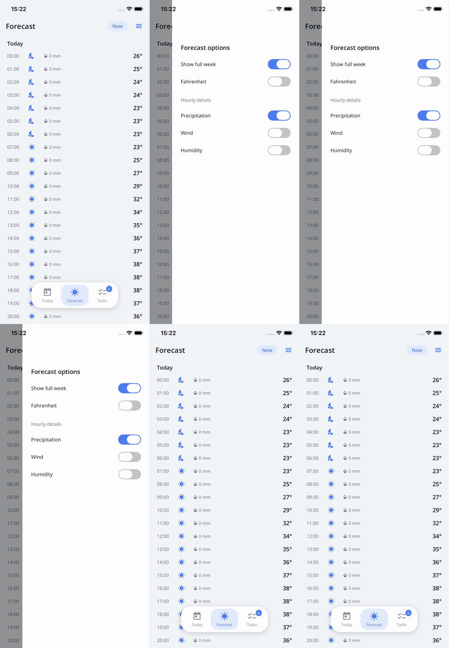
The sample's Forecast page presents a page-level END drawer with custom content; the scrim fades, the drawer slides, and scrim tap dismisses.
Enabling a drawer
Drawers are opt-in: content alone is not enough, the side's mode must allow it.
<nalu:Scaffold nalu:Scaffold.FlyoutStartMode="Flyout">
    <nalu:Scaffold.FlyoutStart>
        <nalu:ScaffoldFlyoutMenuView />
    </nalu:Scaffold.FlyoutStart>
    ...
</nalu:Scaffold>
ScaffoldFlyoutMode |
Behavior |
|---|---|
Disabled (default) |
No drawer, no nav-bar drawer button. |
Auto |
Available at stack roots only (disabled while pages are pushed). |
Flyout |
Always available. |
Content and mode resolve through a stack of overrides: page → area → scaffold — a specific page can present its own drawer content (it is cleaned up when the page leaves the stack).
The menu view
ScaffoldFlyoutMenuView renders the scaffold structure as a menu: a flat entry per VISIBLE
root for a single-root area, group headers for multi-root areas — using each root's
Title/CurrentIcon and selecting through the same engine path as tab taps (guards fire;
selecting the active root pops to root). ScaffoldTabBar areas are excluded by default (their
roots already live in the bar): opt them in with IsTabBarDisplayed="True" — without it, a
tab-bar-only app renders an empty drawer. Customization points: HeaderView, FooterView,
ItemTemplate, PanelBackground, ContentPadding, ItemSpacing, plus the styleable
ScaffoldFlyoutMenuItemView / ScaffoldFlyoutMenuGroupHeader item types. Custom flyout
content can build the same behavior with ScaffoldRoot.SelectCommand.
Options
Set ScaffoldFlyoutOptions per side (FlyoutStartOptions / FlyoutEndOptions) — these are
scaffold-level only, unlike content and mode which resolve page → area → scaffold. Defaults:
WidthRatio 0.85, MaximumWidth 360, scrim black at 40% opacity.
| Property | Purpose |
|---|---|
Width / WidthRatio / MaximumWidth |
Drawer sizing (fixed, or ratio of the window capped by max). |
Scrim |
The dimming brush behind the drawer. |
Programmatic control & state
await scaffold.OpenFlyoutAsync(ScaffoldFlyoutSide.Start);
await scaffold.CloseFlyoutAsync();
From page models, inject the page-scoped IScaffoldFlyoutController — no scaffold
reference needed:
public class MyPageModel(IScaffoldFlyoutController flyout)
{
    public Task OpenMenu() => flyout.OpenAsync(ScaffoldFlyoutSide.Start);
}
Open state is observable: read-only IsFlyoutStartOpen / IsFlyoutEndOpen bindables plus
FlyoutStartOpened/Closed / FlyoutEndOpened/Closed events.
The default nav bar shows drawer buttons automatically; tune with
Scaffold.FlyoutStartButtonVisibility / FlyoutEndButtonVisibility
(Auto = stack roots only, Visible, Hidden) at page/area/scaffold level.
Behavior notes
- The scrim always fades; the drawer slides from its edge. Tapping the scrim or the system back closes the drawer.
OpenFlyoutAsyncno-ops when the drawer doesn't exist right now (no content, or mode disallows it in the current state) — safe to call unconditionally.- Navigation closes any open drawer first.
- While the drawer covers the status-bar area, the system bar icons contrast with the drawer surface.
- On a windowed iPad (iPadOS 26) the system draws its window controls over the window's
top-leading corner, which a LEFT drawer occupies. The scaffold gives that drawer a top
safe-area inset so its first entry clears them — content picks it up by consuming the container
safe area, as
ScaffoldFlyoutMenuViewdoes. An end-side drawer never reaches that corner and is left alone. See the nav bar's account for why the footprint is a measured constant.