Custom Tab Bar
Note: The custom tab bar feature is independent of Nalu's MVVM navigation system. It can be used with standard MAUI Shell as well as
NaluShell.
Nalu provides a custom Shell handler implementation that allows you to replace the native tab bar with a fully customizable cross-platform view.
You can use NaluTabBar (styled built-in control) or draw a completely custom bar (any view + NaluTabBar.GoTo(shellSection) for navigation).
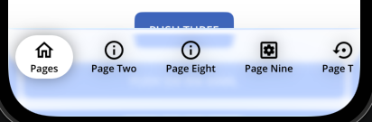
This is especially useful when you need more than 5 tabs (avoiding the native "More" tab on iOS) or want complete control over tab bar styling.
This feature also solves the issues Shell has with pages under the iOS More tab.
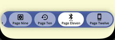
Platform support: Android, iOS, and MacCatalyst only. Edge-to-edge: The custom tab bar allows edge-to-edge behavior when supported (iOS: always, Android: starting from .NET10).
Quick Start
Setup
- Enable the custom tab bar handler in
MauiProgram.cs:
builder
    .UseMauiApp<App>()
    // Optional: Only if using Nalu navigation
    .UseNaluNavigation<App>(nav => nav.AddPage<MainPageModel, MainPage>()) // ⚠️ For AOT compatibility, use AddPage for each page instead of AddPages()
    .UseNaluTabBar()  // Works with both standard Shell and NaluShell
- Create a custom tab bar class by creating a new XAML file (e.g.,
AppShellTabBar.xaml):
You can use what Nalu provides (NaluTabBar) or create your own custom component.
Note: This instance will be bound to its ShellItem (a.k.a TabBar).
Important: Do NOT use Shadow on the outer node due to a bug in MAUI.
<?xml version="1.0" encoding="utf-8"?>

<nalu:NaluTabBar xmlns="http://schemas.microsoft.com/dotnet/2021/maui"
                 xmlns:x="http://schemas.microsoft.com/winfx/2009/xaml"
                 xmlns:nalu="https://nalu-development.github.com/nalu/navigation"
                 x:Class="MyApp.AppShellTabBar"
                 BarShadow="{Shadow Radius=16, Opacity=0.4}"
                 HeightRequest="64"
                 Padding="4"
                 BarBackground="#CC2C479D"
                 BarStrokeShape="RoundRectangle 32"
                 TabStrokeShape="RoundRectangle 32"
                 TabPadding="12,4"
                 TabFontFamily="OpenSansSemibold"
                 ActiveTabStrokeShape="RoundRectangle 32"
                 ActiveTabPadding="12,4"
                 ActiveTabFontFamily="OpenSansSemibold"
                 BarPadding="0"
                 ScrollPadding="4" />
- Create the code-behind file (e.g.,
AppShellTabBar.xaml.cs):
namespace MyApp;

public partial class AppShellTabBar : NaluTabBar
{
    static AppShellTabBar()
    {
#if IOS || ANDROID || MACCATALYST
        NaluTabBar.UseBlurEffect = true;  // Optional: Enable blur effect
#endif
    }

    public AppShellTabBar()
    {
        InitializeComponent();
    }
}
Creating a Completely Custom Tab Bar:
You can use any view as the tab bar (e.g. a Grid or ContentView) and draw it entirely to your liking. If it doesn't inherit from NaluTabBar, handle navigation manually: when a tab button is pressed, call NaluTabBar.GoTo(shellSection) to trigger navigation:
// In your custom tab bar's button tap handler
private void OnTabTapped(object? sender, EventArgs args)
{
    if (sender is BindableObject { BindingContext: ShellSection shellSection })
    {
        NaluTabBar.GoTo(shellSection);
    }
}
The BindingContext of your custom tab bar will be set to the ShellItem (TabBar or FlyoutItem), so you can iterate through ShellItem.Items to access the ShellSection instances for each tab. Each tab button should have its BindingContext set to the corresponding ShellSection so that NaluTabBar.GoTo() can be called with the correct section.
Edge-to-edge and safe area: If page content extends into the bottom safe area (e.g. behind the tab bar), use a root container (e.g. Grid) with SafeAreaEdges="None" and inner content with SafeAreaEdges="Container" so the bar and content respect insets. See Custom TabBarView: Page content extends into bottom safe area (edge-to-edge) for a full example and fixes.
- Attach the custom tab bar view to your
TabBarorFlyoutItem:
With standard Shell:
<Shell xmlns="http://schemas.microsoft.com/dotnet/2021/maui"
xmlns:x="http://schemas.microsoft.com/winfx/2009/xaml"
xmlns:nalu="https://nalu-development.github.com/nalu/navigation"
xmlns:sample="clr-namespace:MyApp"
x:Class="MyApp.AppShell">
<TabBar nalu:NaluShell.TabBarView="{sample:AppShellTabBar}">
<ShellContent Title="Home"
Icon="{FontImageSource FontFamily='MaterialOutlined', Glyph='', Size=24}" />
<ShellContent Title="Search"
Icon="{FontImageSource FontFamily='MaterialOutlined', Glyph='', Size=24}" />
<!-- Add as many tabs as needed - no "More" tab limitation! -->
</TabBar>
</Shell>
With NaluShell:
<nalu:NaluShell xmlns="http://schemas.microsoft.com/dotnet/2021/maui"
xmlns:nalu="https://nalu-development.github.com/nalu/navigation"
xmlns:pages="clr-namespace:MyApp.Pages"
xmlns:sample="clr-namespace:MyApp"
x:Class="MyApp.AppShell">
<FlyoutItem nalu:NaluShell.TabBarView="{sample:AppShellTabBar}">
<ShellContent nalu:Navigation.PageType="pages:HomePage"
Title="Home"
Icon="{FontImageSource FontFamily='MaterialOutlined', Glyph='', Size=24}" />
<!-- More ShellContent items -->
</FlyoutItem>
</nalu:NaluShell>
Styling Properties
The NaluTabBar control provides extensive styling options:
Bar Properties (container):
BarBackground- Background brush for the tab bar containerBarPadding- Padding around the tab bar containerBarMargin- Margin around the tab bar containerBarStroke- Stroke brush for the container borderBarStrokeThickness- Thickness of the container borderBarStrokeShape- Shape of the container borderBarShadow- Shadow effect for the tab bar container
Tab Properties (individual tabs):
TabBackground- Background brush for inactive tabsTabForegroundColor- Text color for inactive tabsTabStroke- Stroke brush for inactive tab bordersTabStrokeThickness- Thickness of inactive tab bordersTabStrokeShape- Shape of inactive tab bordersTabPadding- Padding for inactive tab buttonsTabFontFamily- Font family for inactive tab labels
Active Tab Properties:
ActiveTabBackground- Background brush for the active tabActiveTabForegroundColor- Text color for the active tabActiveTabStroke- Stroke brush for the active tab borderActiveTabStrokeThickness- Thickness of the active tab borderActiveTabStrokeShape- Shape of the active tab borderActiveTabPadding- Padding for active tab buttonsActiveTabFontFamily- Font family for active tab labels
Scroll Properties:
ScrollPadding- Padding for the scroll view container
Tab Bar Scrim View
The TabBarScrimView attached property allows you to overlay a custom view on top of the navigation area while sharing the same safe area insets as the tab bar. This is particularly useful when you want to display popups, overlays, or additional controls (such as a "More" menu) that need to appear above the tab content.
Usage Example:
<TabBar nalu:NaluShell.TabBarView="{sample:AppShellTabBar}"
nalu:NaluShell.TabBarScrimView="{sample:TabBarMorePopup}">
<ShellContent Title="Home"
Icon="{FontImageSource FontFamily='MaterialOutlined', Glyph='', Size=24}" />
<!-- More tabs... -->
</TabBar>
The scrim view will:
- Be positioned above the main navigation content
- Respect the same safe area insets as the main navigation content
- Have its
BindingContextautomatically set to theShellItem(TabBar or FlyoutItem)
Common Use Cases:
- Displaying a "More" menu popup when there are many tabs
- Showing contextual overlays that relate to tab navigation
- Adding custom interactive elements that need to appear above the page content
Blur/Glass Effect
The custom tab bar supports a native blur/glass effect that creates a modern, translucent appearance similar to system tab bars. The effect blurs the content behind the tab bar, creating a frosted glass appearance. On iOS 26+ and MacCatalyst 26+, a native glass effect is used for an enhanced visual experience.
Enabling Blur Effect:
Enable the blur effect by setting NaluTabBar.UseBlurEffect to true in your tab bar's static constructor:
static AppShellTabBar()
{
#if IOS || ANDROID || MACCATALYST
    NaluTabBar.UseBlurEffect = true;
#endif
}
Platform-Specific Customization:
iOS/MacCatalyst:
NaluTabBar.BlurEffectFactory- Factory method to create the blur/glass effect. On iOS 26+ and MacCatalyst 26+, creates aUIGlassEffect; on earlier versions, creates aUIBlurEffectwithUIBlurEffectStyle.Light(default)NaluTabBar.BlurMaskFactory- Factory method to create a custom mask layer for the blur effect (default:null). Note: Effects work properly only with a fully opaque layer. Using a mask may lead to unexpected results, so use with caution.
Android:
NaluTabBar.DefaultBlurRadius- Default blur radius in device-independent units (default: 8)NaluTabBar.BlurEffectFactory- Factory method to create the blur effect (only invoked on Android 12/API 31+)NaluTabBar.BlurShaderFactory- Factory method to create a mask layer for the blur effect (default: vertical gradient from transparent to white)
Note: The blur effect requires .NET 10 on all platforms. On Android, it additionally requires Android 12 (API level 31) or higher. On older Android versions or when using .NET versions prior to .NET 10, the blur effect will be automatically disabled.
Benefits
- ✅ Fully customizable styling - Size, colors, shapes, spacing, shadows, fonts, and more
- ✅ Native blur effect - Modern translucent appearance with native blur support (requires .NET 10; Android additionally requires API 31+)
- ✅ Cross-platform consistent appearance - Same look on all platforms (except Windows)
- ✅ Independent feature - Can be used even without Nalu navigation
- ✅ Edge-to-Edge - Supports edge to edge by default acting like a system bar
See Also
- Navigation Overview - Learn about Nalu's MVVM navigation system
- Navigation Lifecycle - Understanding page lifecycle events
- Navigation Intents - Passing data between pages