Magnet
Magnet is a constraint-based layout: every child is positioned by anchoring its sides to other children,
to virtual nodes (barriers, guidelines, chains) or to the parent stage — the same mental model as Android's
ConstraintLayout, without nesting.
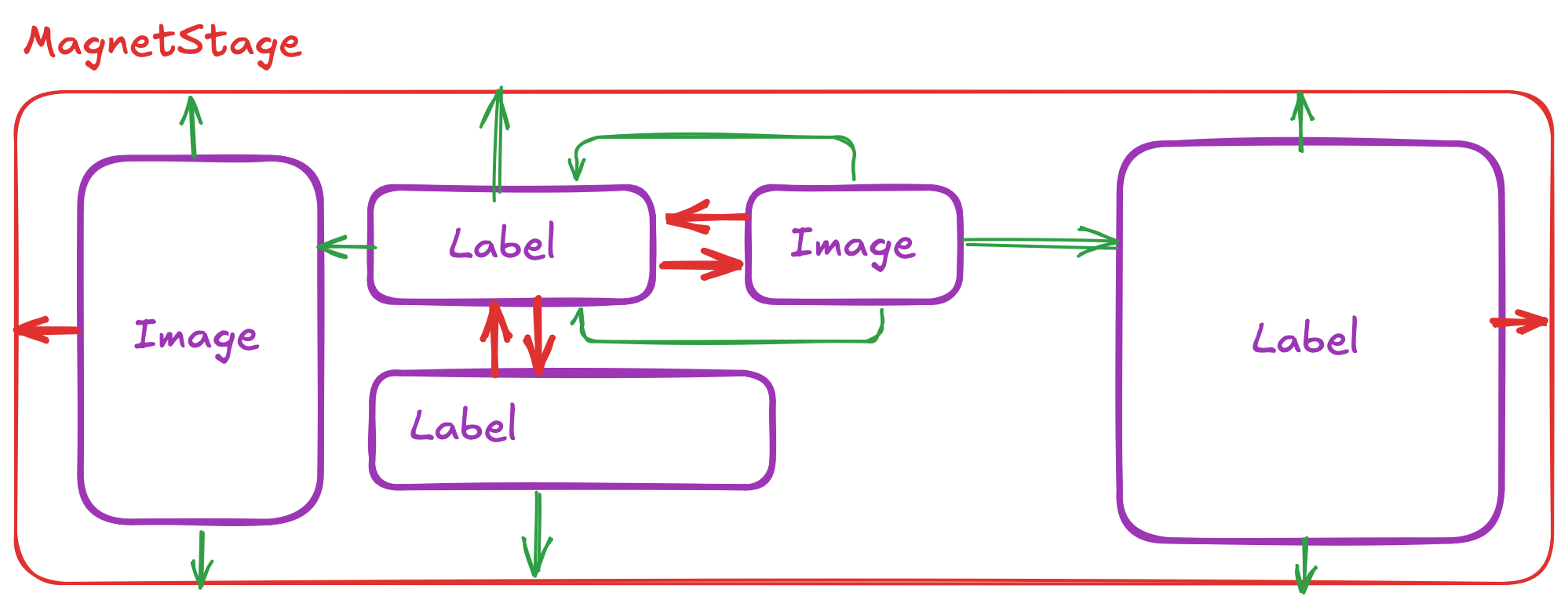
Magnet 2.0 is a full rewrite: the constraint graph is compiled into a small instruction tape that is executed
on every measure/arrange with zero allocations. Measure+arrange cost is now on par with Grid, with a fraction of the
allocations; see Performance.
Coming from Magnet 1.x? Read the migration guide: the API changed.
Quick start
xmlns:nalu="https://nalu-development.github.com/nalu/layouts"

<nalu:Magnet>
  <nalu:Magnet.Definition>
    <nalu:MagnetDefinition>
      <nalu:MagnetBarrier MagnetId="textsEnd" Direction="Bottom" Margin="8" Nodes="avatar,subtitle" />
    </nalu:MagnetDefinition>
  </nalu:Magnet.Definition>

  <Image  nalu:Magnet.MagnetId="avatar"
          nalu:Magnet.WidthSizing="48" nalu:Magnet.HeightSizing="48"
          nalu:Magnet.LeftTo="parent.Left,16" nalu:Magnet.TopTo="parent.Top,16" />
  <Label  nalu:Magnet.MagnetId="title"
          nalu:Magnet.After="avatar,12,0" nalu:Magnet.RightTo="parent.Right,16"
          nalu:Magnet.AlignTop="avatar" nalu:Magnet.HorizontalBias="0" />
  <Label  nalu:Magnet.MagnetId="subtitle"
          nalu:Magnet.AlignLeft="title" nalu:Magnet.Below="title,2" />
  <Button nalu:Magnet.MagnetId="cta"
          nalu:Magnet.FillWidth="parent,16" nalu:Magnet.Below="textsEnd" />
</nalu:Magnet>
Building the mental model is easiest by example: Magnet by example walks through ten screenshot-driven everyday layouts (login screen, list rows, toolbars, barriers, chains, ratios…).
The same in C# (fluent, targets can be ids, views or nodes):
var magnet = new Magnet();
Magnet.GetConstraints(avatar).Id("avatar").Size(48, 48).AlignLeft("parent", 16).AlignTop("parent", 16);
Magnet.GetConstraints(title).Id("title").After(avatar, 12, goneMargin: 0).Right("parent", margin: 16).AlignTop(avatar);
Magnet.GetConstraints(cta).Id("cta").FillWidth("parent", 16).Below("textsEnd");
magnet.Add(avatar);
magnet.Add(title);
magnet.Add(cta);
Concepts
Nodes and identifiers
Everything Magnet positions is a node with a mandatory, unique MagnetId:
| Node | Purpose |
|---|---|
MagnetView |
the constraints of a child view (anchors, size, bias) |
MagnetBarrier |
a line at the outermost Direction pole of a set of nodes |
MagnetGuideline |
a line at a percent/absolute position of the stage |
MagnetChain |
lays a group of views out along one axis (spread / spread-inside / packed, weights) |
Nodes live in a MagnetDefinition. MagnetViews are usually created inline through the attached properties
(Magnet.MagnetId, Magnet.LeftTo, …) or Magnet.GetConstraints(view); virtual nodes are declared in
Magnet.Definition. A MagnetView declared in the definition is bound to the child whose Magnet.MagnetId matches
(the child then carries only the id — a duplicate inline node is an error). If you don't assign a definition,
the layout creates one.
MagnetId is the only identity: nothing falls back to AutomationId. By default the id is copied to
AutomationId when the latter is not set (Magnet.PropagateMagnetIdToAutomationId="False" disables it) — handy for
UI tests.
A
MagnetDefinitionis a pure declaration and can be shared across layouts — declaring one as an app-wideStaticResourceand assigning it to manyMagnets (or every cell of aDataTemplate) is fine and cheaper than inflating a copy per cell: all per-layout state (bound views, engine, transitions) lives in theMagnet. A change to a shared definition (a property, a scene apply) reaches every layout using it.
Anchors
LeftTo / RightTo / TopTo / BottomTo are MagnetAnchors: target.Pole[,margin[,gone:goneMargin]], e.g.
parent.Left, avatar.Right,12, avatar.Right,12,gone:0. Horizontal sides can only reference Left/Right
poles, vertical sides Top/Bottom. Barriers and guidelines have a single pole per axis (textsEnd.Bottom,
mid.Left), chains cannot be targeted (anchor to their first/last member).
The relative shortcuts say the same thing with a verb; their value is a MagnetTarget: target[,margin[,goneMargin]]
("avatar", "avatar,12", "avatar,12,0", "avatar,12,gone:0"):
| Shortcut | Equivalent |
|---|---|
After="a,12" / Before="a,12" |
LeftTo="a.Right,12" / RightTo="a.Left,12" |
Below="a,12" / Above="a,12" |
TopTo="a.Bottom,12" / BottomTo="a.Top,12" |
AlignLeft / AlignRight / AlignTop / AlignBottom="a" |
LeftTo="a.Left" / RightTo="a.Right" / TopTo="a.Top" / BottomTo="a.Bottom" |
HorizontallyWithin / VerticallyWithin / Within="a" |
both anchors of the axis (axes) to a — the view is placed by the bias (0.5 = centered) |
FillWidth / FillHeight="a,16" |
both anchors of the axis to a + WidthSizing/HeightSizing="*" |
All the constraint attached properties are set-only commands (LeftTo…, WidthSizing/HeightSizing, the biases and
the shortcuts): setting one writes into the child's MagnetView node (Magnet.GetConstraints(view), the only place to
read constraints — the static getters are hidden and fail to compile). Several of them may write the same side
(After and AlignLeft both write LeftTo): the last one set wins. Clearing one ({x:Null}, ClearValue) removes the
constraint it wrote only if nobody overwrote it in the meantime. MagnetId is the exception: it is a real, readable
attached property.
- one anchor per axis: the view sticks to it;
- two anchors: the view is placed inside the span using
HorizontalBias/VerticalBias(0..1, default 0.5); - no anchor: the view sits at the stage origin.
GoneMargin is used instead of Margin when the target view is collapsed; a collapsed view drops its own
margins.
Sizes
Magnet.WidthSizing / Magnet.HeightSizing (attached) and MagnetView.WidthSizing / HeightSizing are MagnetSizings. Three
common cases have a string form; everything else uses the {nalu:MagnetSizing} markup extension (Value is the content):
| XAML | Unit | Meaning |
|---|---|---|
| (unset) | Measured |
the view's desired size (default) |
"48" |
Fixed |
fixed dp |
"*" |
Constraint |
fills the span between the two anchors (weighted share inside a chain) |
"50%" |
ConstraintPercent |
a fraction of the span between the two anchors |
{nalu:MagnetSizing 0.5, Unit=StagePercent} |
StagePercent |
a fraction of the stage size, regardless of the anchors (1 = as wide as the layout) |
{nalu:MagnetSizing 1.5, Unit=Ratio} |
Ratio |
1.5 × the other axis |
{nalu:MagnetSizing 1.5, Unit=Measured} |
Measured (scaled) |
1.5 × the view's desired size |
{nalu:MagnetSizing Unit=Constraint, Max=320} |
any + bounds | Min/Max clamp any unit; Max is also the measure constraint of a Measured view (a Label wraps at it) |
In C#: MagnetSizing.Fixed(48), MagnetSizing.Constraint, MagnetSizing.Percent(0.5), MagnetSizing.StagePercent(0.5),
MagnetSizing.Ratio(1.5), MagnetSizing.Scaled(1.5), .WithBounds(min, max), plus implicit conversions from double
(fixed) and from the three string forms.
A Ratio height works with any width; a Ratio width fed by a height that depends on the vertical layout (*, percent —
e.g. a thumbnail as tall as its row) triggers one bounded cross-axis feedback pass (ConstraintLayout semantics): the X
pass uses the height from the previous execution, and X+Y are re-run once when the Y pass changed it. Layouts without
such a node pay nothing for this.
Visibility (GONE)
The single source of truth is the view: IsVisible="False" collapses it — its size becomes 0, anchors to it use
the gone margin, chains and barriers skip it. Toggling visibility never recompiles the layout.
A node can additionally declare a visibility action applied onto the view (see
Scenes below): ApplyVisibility="Hide"/"Show" stamps IsVisible when the
definition attaches, when the view binds, and when the value changes. It is a one-shot write, never read back —
the view remains the runtime truth.
Chains
Chains are explicit nodes (unlike Android, which infers them from mutual anchors):
<nalu:MagnetChain MagnetId="row" Orientation="Horizontal" Style="Spread" Nodes="a,b,c" Weights="2,1,1" />
<!-- equivalent: <x:String> items as element content -->
<nalu:MagnetChain MagnetId="row" Orientation="Horizontal" Style="Spread">
  <x:String>a</x:String><x:String>b</x:String><x:String>c</x:String>
</nalu:MagnetChain>
The chain start is the first member's LeftTo (default parent.Left), the end is the last member's RightTo
(default parent.Right). Inner members must not carry anchors on the chain axis, except anchors to the adjacent
member (which only contribute their margin, e.g. b.LeftTo="a.Right,8") — so gaps can differ per pair, and each
carries its own gone margin (b.LeftTo="a.Right,8,gone:2"). For the common uniform case, declare the gap ONCE on the
chain instead: Gap="8" places it between consecutive visible members (separator semantics: a collapsed member
takes its gap away, no gone margins involved — like Android's Flow flow_horizontalGap); it is animatable, and a
per-pair adjacent anchor overrides it for that pair.
GapMode="Separators" extends the separator semantics to the per-pair anchors and the chain ends — the
StackLayout padding+spacing mental model, per pair: the first member's start margin and the last member's end
margin belong to the chain (they survive the head/tail collapsing, so the first visible member sits at the
chain's leading margin whichever member it is), and a member's margin towards the previous one applies only when
a visible member precedes it (gone margins are not involved). With the default GapMode="Anchors" the margins
follow the ConstraintLayout rules above. "10 A 20 B 30 C" with A and B collapsed yields 30 C in Anchors mode
and 10 C in Separators mode. Collapsed members follow the GONE rules: they drop
their own margins (including the chain's start/end margin when the head/tail collapses), the anchor pointing at a
collapsed member uses its gone margin, and spread gaps only count visible members. Packed uses the first member's
bias (HorizontalBias="0.3" on the head puts the packed group at 30% of the free space). Members sized * share the
remaining space according to Weights (positional, aligned with Nodes, default 1; collapsed members are excluded,
their share goes back to the visible ones). Measured members are measured with the room left by
the other members (in chain order): a packed [name, star] chain lets the name grow until it must ellipsize while the
star stays glued to its right — the pattern that needs a FlexLayout elsewhere.
You do not need a chain for "one view fixed, the other centered in the rest": two anchors and a bias do that
(b.LeftTo="a.Right" b.RightTo="parent.Right"). A chain is for a group distributed as a whole.
Hug vs fill
Measure returns the content extent (every view fits between the stage edges), clamped by the constraint; the
assigned size is used at arrange time. A *-sized child contributes only its margins (and min) to the hug — put
the Magnet in a filling slot when you want fill semantics.
Barriers and guidelines
<nalu:MagnetBarrier MagnetId="textsEnd" Direction="Right" Margin="8" Nodes="title,subtitle" />   <!-- or <x:String> items as content -->
<nalu:MagnetGuideline MagnetId="mid" Orientation="Vertical" Percent="0.5" Position="0" />
A guideline is placed at stageSize × Percent + Position (both animatable). Percent-based guidelines are taken
into account exactly when hugging.
Fluent API (C#)
Magnet.GetConstraints(view) returns the view's MagnetView node (created on first access, registered when the view is
added to the layout); every setter returns the node. Besides the primitives (Left/Right/Top/Bottom(target, pole, margin, goneMargin), Size, Bias, Id) the node offers the same relative shortcuts available in XAML:
Magnet.GetConstraints(avatar).Id("avatar").Size(48, 48).AlignLeft("parent", 16).AlignTop("parent", 16);
Magnet.GetConstraints(title).Id("title")
      .After(avatar, 12, goneMargin: 0)      // LeftTo = avatar.Right (target = view, node or id)
      .Right("parent", margin: 16)
      .AlignTop(avatar);
Magnet.GetConstraints(subtitle).Id("subtitle").AlignLeft(title).Below(title, 2);
Magnet.GetConstraints(cta).Id("cta").FillWidth("parent", 16).Below("textsEnd");   // both anchors + WidthSizing "*"
Magnet.GetConstraints(badge).Id("badge").Within(avatar);

magnet.Definition = new MagnetDefinition().Add(
    new MagnetBarrier { MagnetId = "textsEnd", Direction = MagnetPole.Bottom, Margin = 8 }.With(avatar, subtitle),
    new MagnetChain { MagnetId = "row", Style = MagnetChainStyle.Packed }.With("name", "star"),
    new MagnetGuideline { MagnetId = "mid", Percent = 0.5 });
| Shortcut | Equivalent |
|---|---|
After(t) / Before(t) |
Left(t, Right) / Right(t, Left) |
Below(t) / Above(t) |
Top(t, Bottom) / Bottom(t, Top) |
AlignLeft/Right/Top/Bottom(t) |
same-side anchor |
HorizontallyWithin/VerticallyWithin/Within(t) |
both anchors of the axis (axes) — centered by the bias |
FillWidth/FillHeight(t) |
both anchors + WidthSizing/HeightSizing = "*" |
Every target accepts an id string, a MagnetTarget ("avatar,12,gone:0"), a view carrying Magnet.MagnetId (or an
inline node with Id(...)) or a node; MagnetChain.With(...) / MagnetBarrier.With(...) accept views too.
Shortcuts and primitives write the same node property: the last one wins. MagnetSizing.Fixed/Constraint/Percent/ StagePercent/Ratio/Scaled and implicit conversions from double (fixed) and from the three string forms. The attached
setters (Magnet.SetAfter(view, "avatar,12")) write into the same node.
Changing constraints at runtime
Every node property is bindable. Changes are classified: values (margins, biases, sizes, percents, weights)
patch the compiled tape; structure (targets, poles, units, nodes added/removed) recompiles it. Both coalesce
into a single InvalidateMeasure.
Compile errors (unknown target, axis mismatch, cycles, zero chain weights, …) surface as
InvalidOperationException from the first measure after the offending change; every message names the
MagnetIds and properties involved.
Transitions
await magnet.TransitionToAsync(() =>
{
    Magnet.GetConstraints(avatar).Left("parent", margin: 80).Top("parent", margin: 80);
    details.IsVisible = true;
}, length: 300, easing: Easing.CubicInOut);
TransitionToAsync(Action mutate) applies the mutation and animates from the current state to the new one:
- value-only changes interpolate the constraint inputs, so intermediate frames obey the constraints exactly
(animating a guideline
Percentor a chain weight moves every dependent view correctly); - structural changes and visibility toggles interpolate frames; appearing views fade in (a view hidden with a
manual
IsVisible=falsedisappears immediately — the platform hides it before the animation can run; useApplyVisibility="Hide"on the node to get the animated fade-out); - a new transition retargets from the current interpolated state (the previous task completes with
false); - when the layout's own size changes the ancestors reflow every tick (inherently more expensive).
TransitionToAsync(MagnetDefinition end) swaps the whole definition, matching nodes by MagnetId.
Scenes (two definitions, animated)
A "scene" is a definition that declares both the geometry and the visibility of the views it manages, using
ApplyVisibility on its nodes:
<nalu:MagnetDefinition x:Key="SceneA">
  <nalu:MagnetView MagnetId="badge" ApplyVisibility="Show" ... />
</nalu:MagnetDefinition>
<nalu:MagnetDefinition x:Key="SceneB">
  <nalu:MagnetView MagnetId="badge" ApplyVisibility="Hide" ... />
</nalu:MagnetDefinition>
await magnet.TransitionToAsync(sceneB); // the badge fades out while its siblings animate to the collapsed layout
Applying a scene inside a transition defers the visibility writes: a Hide on a visible view freezes it in place
and fades it out (Opacity → 0), its siblings animate to the layout solved as if it were already collapsed, and
IsVisible = false lands at the end (also when the transition is interrupted); a Show applies up front and fades
in. Outside a transition (a plain Definition swap, or a late-bound child) the action applies immediately.
Swapping the whole definition is not required — toggling the node property inside the mutate gets the same animated treatment:
await magnet.TransitionToAsync(() => badgeNode.ApplyVisibility = MagnetVisibilityAction.Hide);
ApplyVisibility applies on change: re-assigning the value it already holds is a no-op (so after manually
setting the view's IsVisible back, re-assert a scene action by passing through None first).
Rules to keep scenes predictable:
- Scenes are total, there is no auto-revert: swapping back to a definition with no opinion (
None, the default) leaves the view as the previous scene left it. Each scene declaresApplyVisibilityfor every view it manages. - Ownership: applying writes
IsVisiblewith standard MAUI semantics, which permanently detaches any binding on that property. A view whose visibility is scene-managed must not also bindIsVisible— in MVVM, trigger the transition from the view model instead of binding the visibility. - Scene visibility works with definition-declared nodes (views bound by
MagnetId); views carrying inline constraints cannot be scene-hidden (an id declared both inline and in the definition is an error). ApplyVisibilitydoes not affect the compiled layout: definitions differing only in visibility actions share the same compiled tape.
Performance
Benchmarks (Tests/Nalu.Maui.Benchmarks, Apple M-series). Two scenarios, both with the same leaf views for Grid and
Magnet; 1000 × measure+arrange per row, inflation = 100 instances including compile and first layout.
Row: 5 views in one row, the middle one filling the remaining space (Grid Auto,Auto,*,Auto,Auto vs a horizontal
MagnetChain with a * member).
| Method | Grid | Magnet 2 |
|---|---|---|
| Child invalidated every pass (e.g. text change) | 0.72 ms / 1.45 MB | 0.94 ms / 0.33 MB |
| Nothing changed (MAUI re-measures often) | 0.68 ms / 1.43 MB | 0.87 ms / 0.31 MB |
| Changing bounds (rotation) | 0.96 ms / 1.70 MB | 1.19 ms / 0.58 MB |
| Value patch (animated margin) + relayout | – | 1.42 ms / 0.58 MB |
| Inflation | 4.5 ms / 7.8 MB | 4.9 ms / 8.7 MB |
Card (the sample-app credit card: image | name + star / detail | money): the Grid version needs three nested layouts
(Grid + VerticalStackLayout + FlexLayout), the Magnet version is flat (a packed name+star chain).
| Method | Grid (3 layouts) | Magnet 2 (flat) |
|---|---|---|
| Child invalidated every pass | 0.53 ms / 1.07 MB | 0.62 ms / 0.33 MB |
| Nothing changed | 0.48 ms / 1.05 MB | 0.57 ms / 0.31 MB |
| Inflation | 3.2 ms / 4.8 MB | 2.6 ms / 4.7 MB |
These benchmarks measure only the managed layout algorithm (no handlers, no platform views). They ignore what nested layouts cost in a real app: every extra layout is an extra native view (
UIView/ViewGroup/Panel) to create and map, one more native→managed round trip (JNI/Objective-C) per measure and arrange pass, one more level for native traversals (window insets, hit-testing, accessibility), one more layer to render and more native memory. A flatMagnetreplaces that whole nesting with a single native view: the ~0.2 µs of algorithmic overhead per relayout is noise next to a single native measure call, and the saved hierarchy is what actually shows up in list scrolling.
On device (TestApp "Magnet Perf" page)
The TestApp ships a manual benchmark page (Magnet Perf) that inflates N cards of both flavours and hooks
SizeChanged on every element of every card: "settled" is the last size change of the whole subtree, i.e. the real end
of the native layout pass. Debug builds (JIT, no AOT), 200 cards, warm second run — absolute numbers are inflated by the
Debug configuration, the ratio is what matters:
| 200 cards, warm run | iPhone simulator | Android emulator (arm64) |
|---|---|---|
Inflate: create + Add (handlers + native views) → settled |
Grid 1600 ms · Magnet 1352 ms (−16%) | Grid 1999 ms · Magnet 1219 ms (−39%; layout phase after Add: 321 vs 166 ms) |
| Text change on every card → settled | Grid 253 ms · Magnet 185 ms (−27%) | Grid 390 ms · Magnet 102 ms (−74%) |
SizeChanged events per inflate |
Grid 1800 · Magnet 1267 | Grid 1800 · Magnet 1267 |
The numbers are collected by the opt-in MagnetPerfStatsTests DevFlow test (set MAGNET_PERF_OUT to a file
path), which drives the page: a discarded cold inflate to warm the JIT, then the recorded warm inflate and
text change per flavour.
On device the flat Magnet wins on every scenario, by the cost of the two native views per card that the nested Grid
needs. Magnet VirtualScroll Perf (2000 cards in a VirtualScroll, definition declared inline in the template) shows
the recycled-cell case: a handful of inflations, one compilation shared by every cell.
Takeaways (managed only): a full relayout costs 1.2–1.3× a Grid with 3–4.7× fewer allocations (the generic tape
interpreter does more work than three trivial specialized layouts, see the on-device numbers for the other side of the
coin); an arrange that follows a measure with matching bounds re-uses the child measures — and when only the stage
size differs from the measured one, the solver replays the measure's affine solution at the arrange size instead of
re-executing the tape (delta arrange); an arrange without a measure in between (recycled cells) re-measures; the
remaining allocations come from MAUI's own Measure/Arrange plumbing (the engine allocates only when compiling).
Compiled tapes are pure and shared through a process-wide LRU cache keyed by the structure of the definition, so
template-instantiated cells compile once; the flat Magnet card even inflates faster than its three nested layouts,
and sharing one MagnetDefinition across cells (see above) trims per-cell inflation further.
The cache holds 64 distinct structures by default (a safety net, not a tuning knob: an evicted structure is
transparently recompiled in a few tens of microseconds) and is configurable via Magnet.CompilationCacheCapacity.
When to use Magnet
Good use cases: complex layouts that would need nested Grid/StackLayouts, elements positioned relative to
several others, responsive layouts adapting to content size, layout-driven animations.
Consider alternatives for trivial layouts a Grid or StackLayout expresses directly.