ExpanderViewBox
ExpanderViewBox is a custom view that fully displays or collapses its content by animating the size transition.
You can use +Infinity collapse size to enable size-change animations.
This component is also useful for scenarios where you want to show or hide additional information dynamically or if you want to build an accordion control.
Basic Usage
Here's an example of how we can use it to build a section that can be expanded or collapsed through a button only when the content exceeds the CollapsedHeight.
private void ToggleExpended(object? sender, EventArgs e)
{
    TheExpander.IsExpanded = !TheExpander.IsExpanded;
}
<VerticalStackLayout>
<!-- This button is only visible when the expander's content is bigger than the collapsed size. -->
<Button Text="Toggle expanded"
Clicked="ToggleExpended"
IsVisible="{Binding Path=CanCollapse,
Source={x:Reference TheExpander},
x:DataType=nalu:ExpanderViewBox}"/>
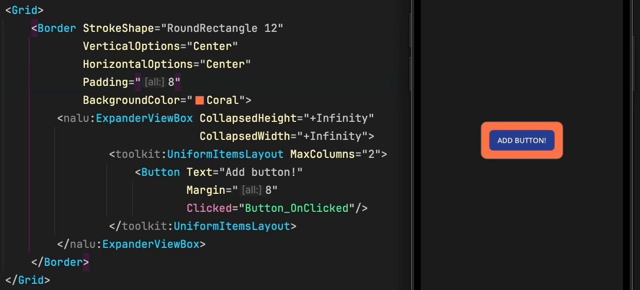
<nalu:ExpanderViewBox x:Name="TheExpander"
BackgroundColor="Coral"
CollapsedHeight="200">
<VerticalStackLayout VerticalOptions="Start">
<Label Text="List of my friends" />
<!--
The height of this stack layout depends on the number of friends,
so the height will change at runtime and may or may not exceed the collapsed height.
-->
<VerticalStackLayout BindableLayout.ItemsSource="{Binding Friends}"
BindableLayout.ItemTemplate="{StaticResource FriendTemplate}" />
</VerticalStackLayout>
</nalu:ExpanderViewBox>
</VerticalStackLayout>
Properties
| Property | Type | Default | Description |
|---|---|---|---|
IsExpanded |
bool |
false |
Whether the content is fully expanded |
CollapsedHeight |
double |
0 |
The height when collapsed. Use +Infinity for size-change animations only |
CanCollapse |
bool |
(read-only) | Whether the content exceeds the collapsed height |
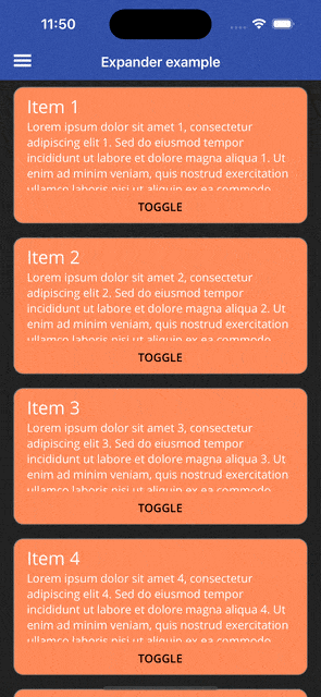
Inside CollectionView
You can even use ExpanderViewBox as a CollectionView's ItemTemplate to animate the size change of each item.
private void ScrollToMe(object? sender, EventArgs e)
{
    TheCollectionView.ScrollTo((sender as BindableObject)?.BindingContext);
}
<CollectionView ItemsSource="{Binding Items}"
                x:Name="TheCollectionView">
    <CollectionView.ItemTemplate>
        <DataTemplate x:DataType="pageModels:MyItem">
            <nalu:ViewBox Padding="16,8">
                <Border StrokeShape="RoundRectangle 12"
                        BackgroundColor="Coral">
                    <VerticalStackLayout>
                        <nalu:ExpanderViewBox CollapsedHeight="126"
                                              IsExpanded="{Binding IsExpanded}">
                            <VerticalStackLayout Padding="16,8">
                                <Label Text="{Binding Name}" FontSize="Large"/>
                                <Label Text="{Binding Description}"/>
                            </VerticalStackLayout>
                        </nalu:ExpanderViewBox>
                        <Button Text="Toggle"
                                BackgroundColor="Coral"
                                TextColor="Black"
                                Clicked="ScrollToMe"
                                Command="{Binding ToggleCommand}"/>
                    </VerticalStackLayout>
                </Border>
            </nalu:ViewBox>
        </DataTemplate>
    </CollectionView.ItemTemplate>
</CollectionView>
Use Cases
- Read more / Read less - Show a preview of long text content
- Accordion menus - Build collapsible menu sections
- Detail panels - Expand to show additional information
- Form sections - Collapse optional form fields
- List item details - Expand items in a list to show more details